
Two weeks ago we unveiled our new visual identity. Today's post is aimed at giving you a look behind the Foojee curtain to see the process and iterations of designs we went through before settling on the look you see today.
We attempt to be intentional and calculated in every thing we do.
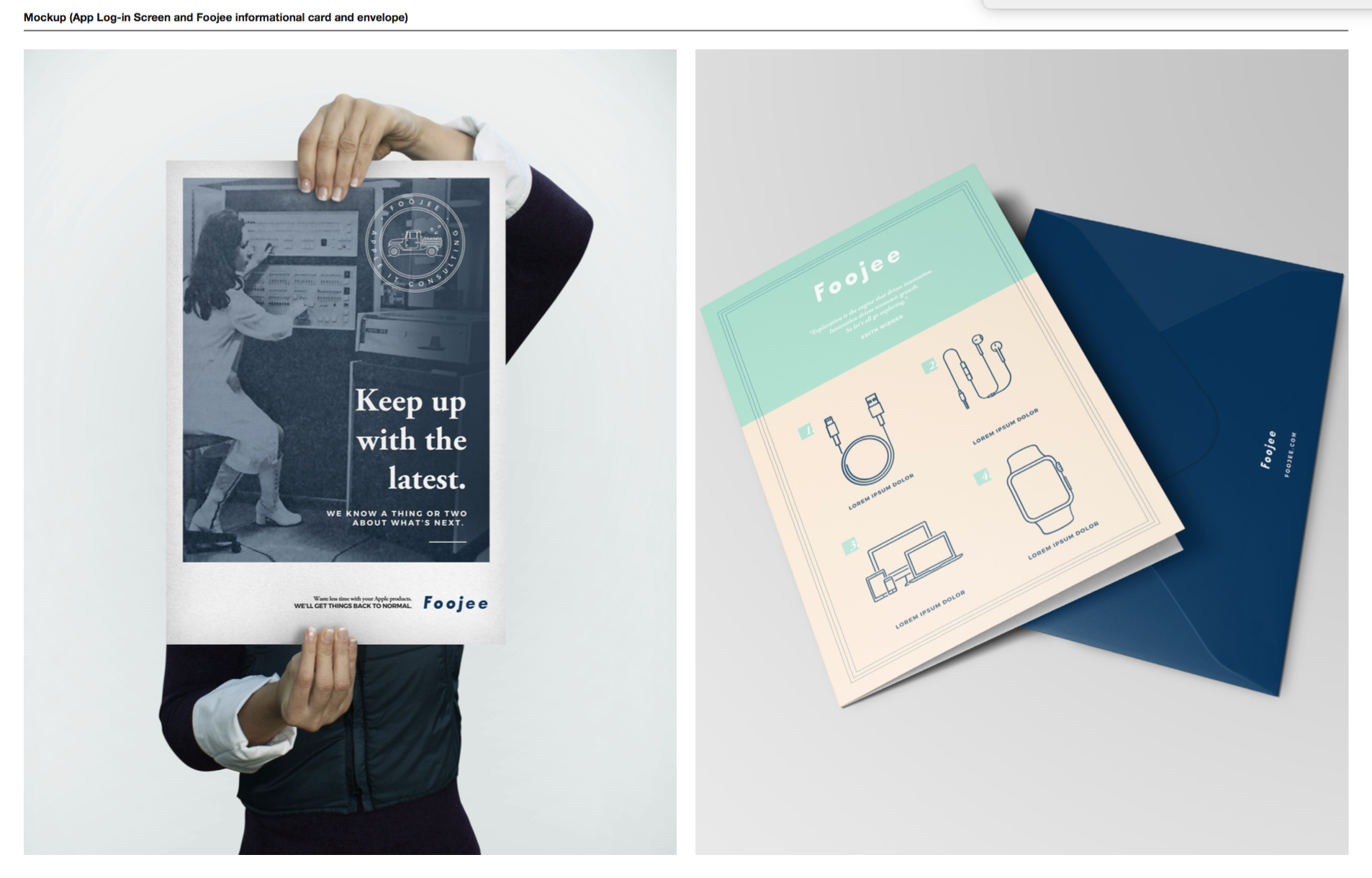
Our brand is constantly under development through our interactions with people, our painstaking approach to website copy and blog content, email communication, and even in the video scripts we write. We wanted a visual identity that accurately reflected who we are, what we do, and where we're headed.
For those of you who may be unfamiliar with our old identity, check out the images below.

Our old logo was created for fifty bucks using glance.com. It was simple, and it fit Foojee at the time. We wanted a mark that didn't have too many embellishments, and hinted at a more organic feeling. "Natural" and "organic" aren't words that typically come to mind when you think of an IT company, and we thought that tied into how we wanted to do IT (and still do).
This year, we brought on a Director of Marketing and one of the first big projects was to develop a new visual identity. We talked with a number of outstanding firms and designers. We landed on a local freelancer with a track record of excellence and a knack for design that blew us away. Russell Shaw, is a designer and illustrator from Atlanta who has worked with a number of well known brands and does fantastic work. Russell has a clean and sophisticated aesthetic with playful and human elements woven in.
After choosing Russell, we went dove deep into who we are and how to convey that to others through a discovery phase which resulted in our first round of concepts.
We were blown away by the depth and detail of the initial concepts. Not pictured are a dozen other pages with detailed explanations along with collateral illustrations and complementing designs.
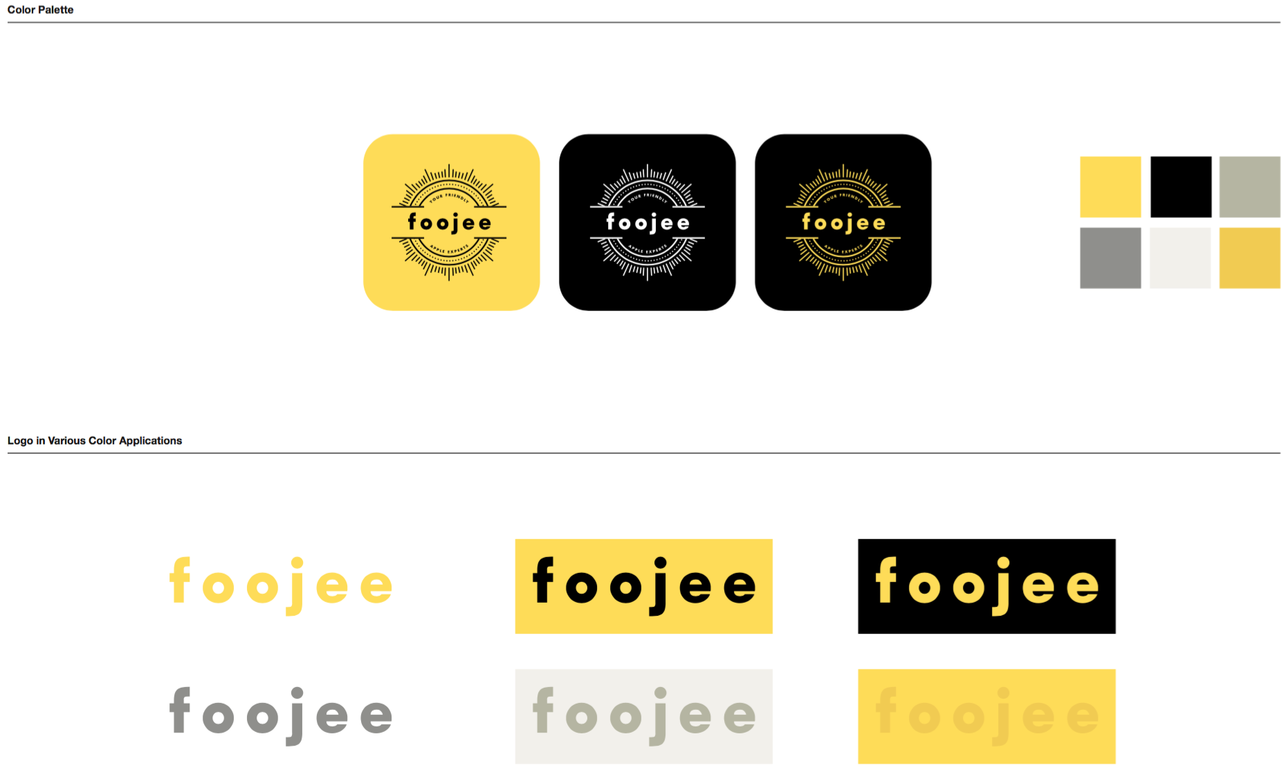
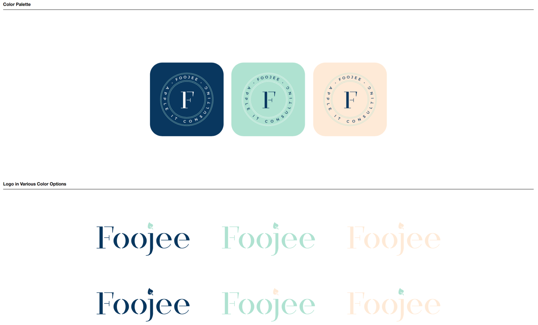
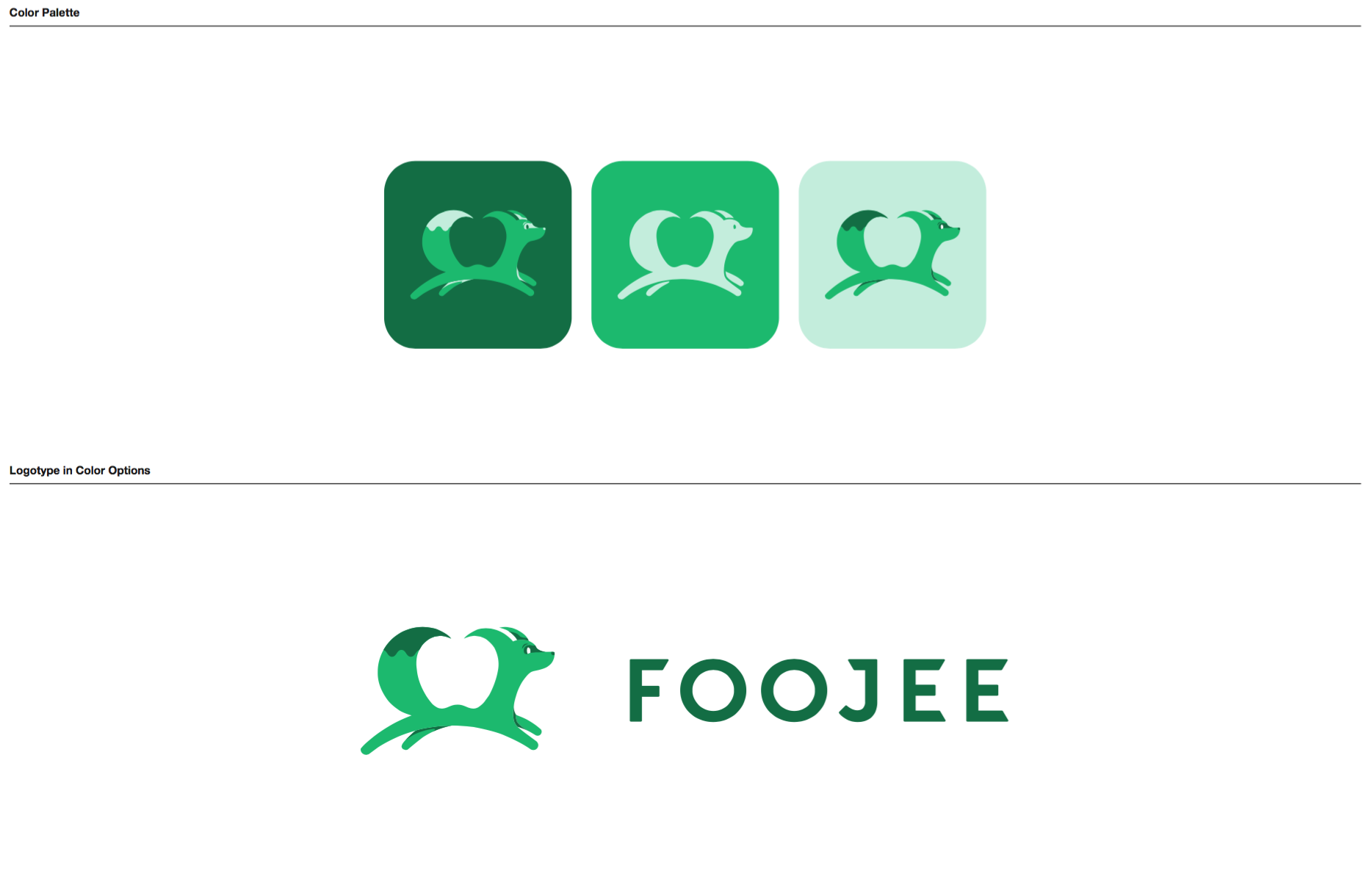
This first round of concepts was tremendously difficult with so many options. We liked different parts of each concept and faced the challenge of figuring how to weave them together. The boldness of the first concept struck us immediately with its bright colors (yellow) and stark contrast. To us the second concept's color palette (navy, mint, cream) came off as relational, approachable, and strong. The third concept (green fox) was innovative and creative in it's approach and execution. We liked the idea of the Foojee Fox in our materials, but we decided as a team that it didn't add to who were were as a company, nor our brand.
For the next round of revisions, we wanted to keep the boldness of concept 1, but lay that boldness on the colors and illustrations of concept 2. We knew we needed to find a word mark that fit our personality. The next round of revisions attempted to tackle those challenges by giving us a few options for the word mark and some secondary illustrations to help us move the project forward.
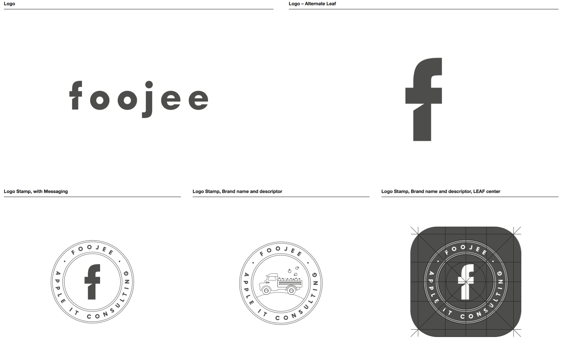

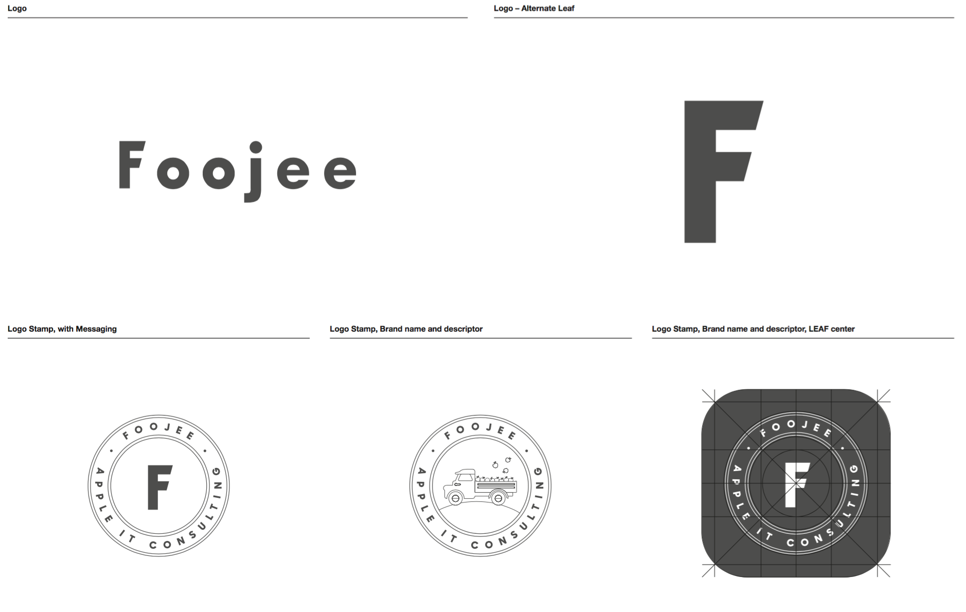
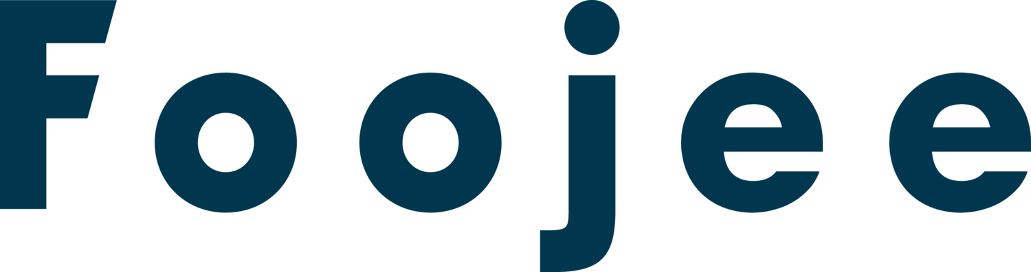
We loved the disarming charm of the lowercase "foojee", but ultimately felt it was not distinguishable. Because of the world we live in, a lower case "f" and any shade of blue will always bring up connotations of Facebook and we didn't want to cause identity confusion for clients and strangers. For those reasons, we chose to go with the uppercase "F" in our word mark. In order to convey the boldness and edginess we want Foojee to have, our final word mark has sharper edges and angles than many of the other concepts. Notably, along with customizing the typeface of our word mark, Russell adjusted the capital "F" to be distance enough to stand on its own.
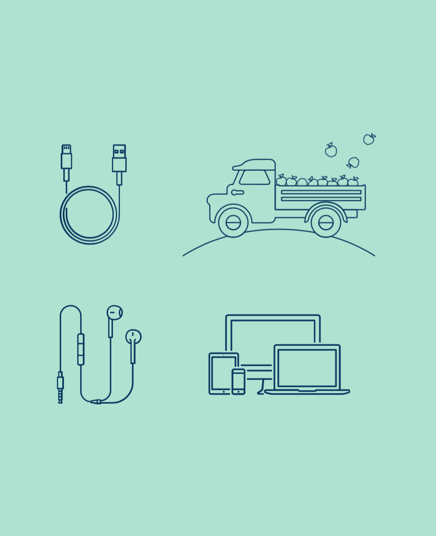
The secondary illustrations we received from concept 2 blew us away. We can't say enough about our love for the apple truck. What you see in the slideshow above is the original concept we received for the apple truck and it was spectacular, but as the project developed we felt the truck needed to mature.

We saw the updated truck and knew our designer had nailed it. We wanted the charm and innocence of the original apple truck to be updated to match the sharper angles and bolder lines of our word mark and overall aesthetic. Russell delivered and we love the overall final product.
This project was a large undertaking for Foojee and it required us to take a deep look inside at who we are, who we want to be, and how to best convey that to the world. We are thrilled with the results! We wholeheartedly believe our new visual identity is one that not only represents us accurately, but timeless as well. We plan to be around for a while.
If you've got questions, we'd love to hear from you!